
NavAble
End to end mobile app design
Oct - Dec 2024
UX/UI Designer

Empowering people of all abilities to discover accessible experiences with confidence
Mobile app empowering people with disabilities to discover accessible activities
The Problem
Unreliable accessibility information prevents people with mobility needs from confidently exploring new places.
My Solution
End-to-end mobile app design featuring personalized recommendations and crowdsourced accessibility reviews.
What issues exist with information accessibility?
Many places claim to be accessible, but the reality often falls short—leading to unexpected challenges and frustration.
There’s a serious lack of detailed accessibility information, making it hard for people with physical disabilities to plan outings with confidence.
Because of this uncertainty, many people with mobility needs avoid exploring new places and activities altogether.

01 - Research
Deep dive into the accessibility space
To gain a deeper understanding of the problem and identify what sets NavAble apart from existing solutions, I conducted research on industry practices. This helped me gather insights and inspiration to refine my app’s approach.
Competitive Analysis - Comparing to some travel and event planning platforms:

Pros: These platforms provide photos of accessibility features, along with social components like forums and discussions that offer valuable firsthand insights.
→What this means for NavAble: This highlighted the importance of visualization and community-driven information sharing, inspiring me to explore similar features for my design.
Cons: The lack of customizable search options for specific mobility needs was a major limitation. Many “wheelchair-friendly” filters were too broad or oversimplified, failing to capture the diverse accessibility requirements of users.
→ What this means for NavAble: This reinforced the need for NavAble to offer more precise and customizable search filters tailored to individual needs.

Pros: These platforms leverage community reviews and detailed tagging of accessibility features, making the information more reliable and user-driven.
→What this means for NavAble: This reinforced the value of community-sourced insights and inspired me to make user reviews and detailed feature tagging a core component of NavAble.
Cons: Despite the wealth of information, there is no way to personalize searches or receive curated recommendations, leaving users to sift through large amounts of data on their own.
→ What this means for NavAble: This highlighted an opportunity for NavAble to stand out by incorporating smart recommendations that tailor activity suggestions to individual needs.
User interviews
“It’s hard for me to trust the systems in place that are supposed to help with accessibility” - Permanent wheelchair user with cerebral palsy
1
Users found it helpful to see ratings from others with similar profiles and needs, viewing it as a reliable source of insight.
2
Younger wheelchair users are more independent and eager to try new experiences.
3
Wheelchair users prioritize independence, while moms with strollers are more adaptable and open to assistance.
Initially, I planned to design for people with permanent or temporary mobility challenges, including pregnant women and parents with strollers. However, user interviews revealed that these groups have distinctly different needs. I decided to focus specifically on active adults in their 30s and 40s who have mobility disabilities.

02 - Research Synthesis
After user interviews, I mapped the full journey from decision to completion, identifying key pain points and opportunities. This helped prioritize improvements to ensure NavAble delivers meaningful solutions.
I chose to focus on the first half of the user journey, where most of the pain points occur. The key issues we aim to address are:
Inconsistent and unreliable accessibility information
Lack of visual context for what places actually look like
Google reviews that don’t reflect the mobility profiles of the reviewers
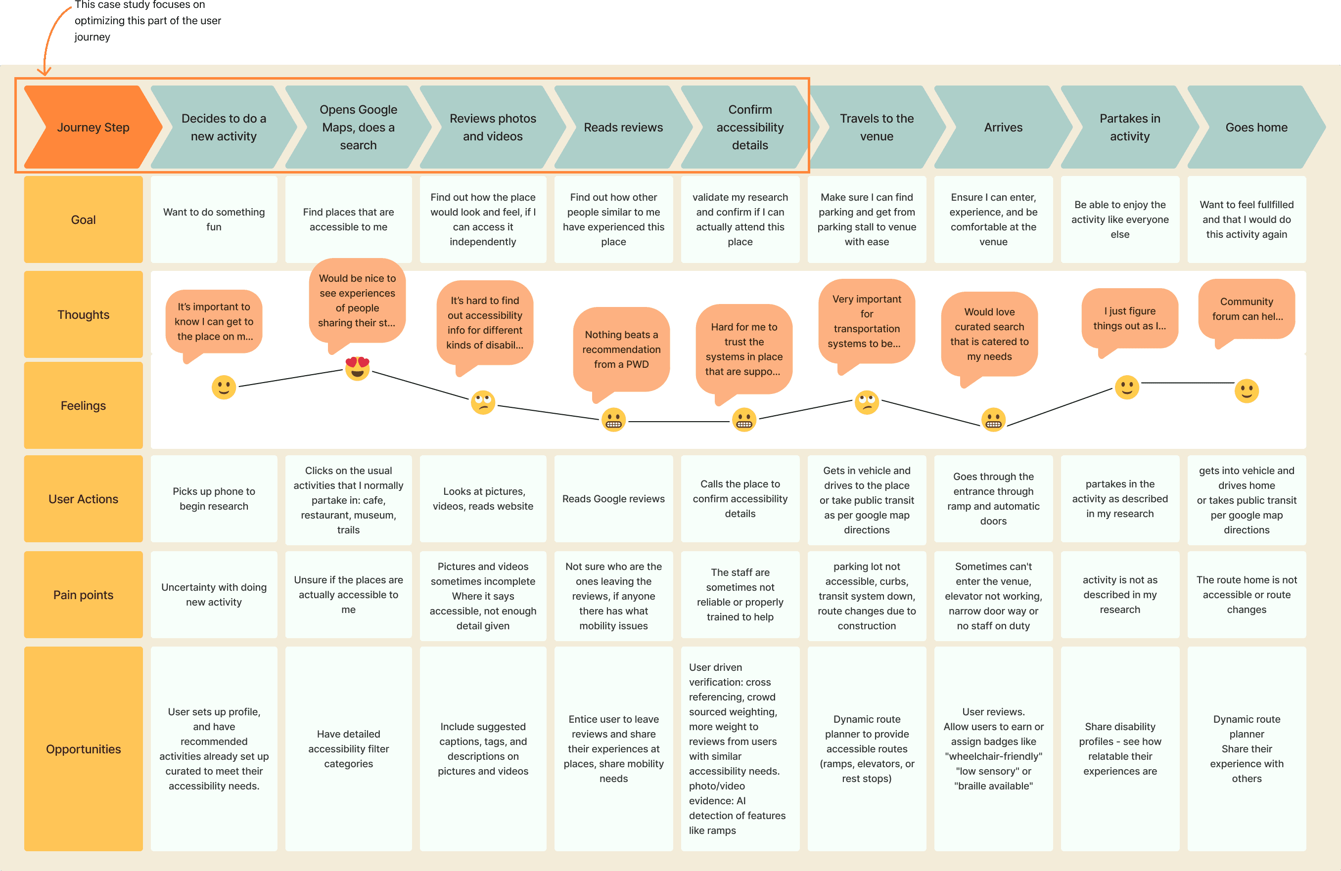
This point in the user journey prompted a deeper exploration of the core problem:
How might we create curated experiences for people with disabilities so that they are excited to try new activities in their city?
03 - Ideate
Since my user interviews show that users are most frustrated with researching and confirming accessibility features of a new place, I decided to prioritize addressing the pain points in the initial stages of the journey.
1- Personalized activity recommendations
Why? Every participant valued curated, tailored suggestions catered to their needs and preferences over generic lists.
2- Crowdsourced reviews
Why? Users like to see how others with similar mobility challenges experience the activity beforehand. However, maintaining an on going social engagement like an online forum felt overwhelming and unnecessary.
3- Target users in their 30s and 40s
Why? research showed the strongest engagement from adults with mobility impairments in their 30s and 40s, who see themselves as adventurous and seek new experiences. With greater independence and upper body strength, they differ from elderly users. This aligns with NavAble’s mission to help users confidently find accessible activities.
4- Tactful UX writing & content
Why? Many people with physical disability experience mental health challenges, especially those with chronic pain. Filling out medical forms can feel triggering, so the language and flow must be sensitive and supportive.
5- The initial idea of virtual reality or 3D walkthrough visualization feature
Why? VR and 3D walkthroughs can overwhelm users with visual impairments or limited motor abilities. While some visualization, like photos, is helpful, users prioritize crowdsourced reviews and activity recommendations over immersive elements.
6- The initial idea of targeting moms
Why? Moms with strollers and wheelchair users have significantly different preferences. Moms are comfortable asking for help and adapting, while wheelchair users prioritize independence. To stay focused, Version 1 will cater specifically to individuals with disabilities.
In implementing my design choices for NavAble, I decided to focus on three main flows for version 1:
The onboarding flow will be designed to collect user preferences and personal accessibility needs, ensuring tailored recommendations.
A separate flow will allow users to research the accessibility of places they want to visit.
A third flow will give the option for users to rate the accessibility of a place after visiting. Given the target audience, the design will emphasize a vibrant and engaging experience, promoting an active and adventurous lifestyle.

04 - Design


Through my research, I identified active adults in their 30s and 40s with mobility impairments as the primary user group. To align with their needs and aspirations, I defined the core values of their experience: Empowerment, Inclusivity, Reliability, Camaraderie, Innovation, and Optimism. I aimed to reflect these values through color and visual design, creating a fun and engaging experience that feels inviting—rather than medical.
NavAble Style Guide

UI Components

05 - Testing
To refine NavAble’s usability, I conducted tests on three key user flows, uncovering valuable insights for improvement.
Onboarding Experience
Users completed the onboarding flow at a 100% success rate, but many found the transition between entering personal information and selecting activity preferences abrupt. Given that NavAble introduces a new concept, some participants felt that a brief introduction would provide helpful context before starting the process.
Activity Search
While users valued the personalized activity suggestions and found accessibility details useful, the transition from the map view to the activity list remained unclear. Further refinements are needed to enhance navigation between these sections.
Accessibility Ratings
While the rating process was generally well-received, some users found the linear format too rigid, preferring the flexibility to navigate between sections in their own order. Additionally, the icons on the first page of the rating flow felt unfamiliar and somewhat confusing. Though users recognized they weren’t interactive, their purpose wasn’t immediately clear.
06 - Finalize
Guided by usability test results, I iterated on my designs, making key improvements and additions to enhance the user experience.


The usability tests provided key insights into how users engage with NavAble, guiding refinements to enhance intuitiveness, efficiency, and overall user experience. Participants appreciated the platform’s empowering nature, describing it as a tool that makes them feel capable and in control.
Testing the updated color scheme yielded unanimous approval, with users agreeing it successfully conveyed a sense of fun while avoiding a clinical or medical aesthetic. Icons were particularly well-received, described as playful, easy to understand, and reinforcing the app’s friendly tone.
Key Insights:


Future plans for NavAble
My favorite part about NavAble was solving a problem, with a solution that had direct benefits to the end user. I really enjoyed diving deep into a user's journey and fully understanding the challenges that they're facing. It wasn't easy, but I loved learning about the real, diverse needs of people with disabilities. Moving forward, I would love to turn NavAble into a fully working app that can help even more people with mobility needs.